UI5 Web Components for React
A React Wrapper around UI5 Web Components
Why React?
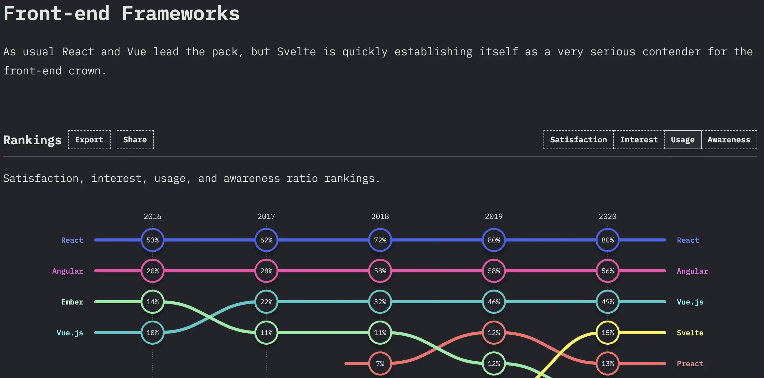 Source: https://2020.stateofjs.com/en-US/technologies/front-end-frameworks/
- React has been the most used JS Framework for years
- Huge Ecosystem and Community
React
A JavaScript library for building user interfaces
Declarative
React makes it painless to create interactive UIs. Design simple views for each state in your application, and React will efficiently update and render just the right components when your data changes.
Declarative views make your code more predictable and easier to debug.
Component-Based
Build encapsulated components that manage their own state, then compose them to make complex UIs.
Since component logic is written in JavaScript instead of templates, you can easily pass rich data through your app and keep state out of the DOM.
Learn Once, Write Anywhere
We don’t make assumptions about the rest of your technology stack, so you can develop new features in React without rewriting existing code.
Disclaimer: This content is copied from the React Website, https://reactjs.org
Basic React Component
function MyComponent() {
  return <button onClick={() => alert("Hello World!")}>Click Me!</button>;
}
Using Custom Elements in React
The current versions of React (react 16 and react 17) both have some shortcomings in using CustomElements in your
React components:
- incorrect handling of
booleanattributes - custom event handlers are not attached
- inconsistencies with regular React props
Incorrect handling of boolean attributes
import "@ui5/webcomponents/dist/Button";

function MyComponent() {
  return (
    <>
      <ui5-button
        onClick={() => alert("I'll be there onClick!")}
        disabled={false}
      >
        Click me!
      </ui5-button>

      <ui5-button
        onClick={() => alert("I will never show up!")}
        disabled={true}
      >
        But you can't click me!
      </ui5-button>
    </>
  );
}
How to fix it
import "@ui5/webcomponents/dist/Button";

function MyComponent() {
  const booleanPropsBtn1 = {};
  const booleanPropsBtn2 = {};

  const button1ShouldBeDisabled = false;
  const button2ShouldBeDisabled = true;

  if (button1ShouldBeDisabled === true) {
    booleanPropsBtn1.disabled = true;
  }
  if (button2ShouldBeDisabled === true) {
    booleanPropsBtn2.disabled = true;
  }

  return (
    <>
      <ui5-button
        onClick={() => alert("I'll be there onClick!")}
        {...booleanPropsBtn1}
      >
        Click me!
      </ui5-button>

      <ui5-button
        onClick={() => alert("I will never show up!")}
        {...booleanPropsBtn2}
      >
        But you can't click me!
      </ui5-button>
    </>
  );
}
Custom event handlers are not attached
import "@ui5/webcomponents/dist/Calendar";

function MyComponent() {
  return (
    <ui5-calendar
      onSelectedDatesChange={(e) => {
        e.detail.dates.forEach((d) => alert(new Date(d * 1000)));
      }}
    />
  );
}
How to fix it
import "@ui5/webcomponents/dist/Calendar";

function MyComponent() {
  const ref = useRef();

  useEffect(() => {
    const currentRef = ref.current;
    const handler = (e) => {
      e.detail.dates.forEach((d) => {
        alert(new Date(d * 1000));
      });
    };

    // bind the event handler after the component has mounted
    if (currentRef) {
      currentRef.addEventListener("selected-dates-change", handler);
    }

    // remove the event handler before component unmounts to free up memory
    return () => {
      if (currentRef) {
        currentRef.removeEventListener("selected-dates-change", handler);
      }
    };
  }, []);

  return <ui5-calendar ref={ref} />;
}
Inconsistencies with standard React Props
Let's pretend that we have this CSS definition available on our website:
<style>
  .textColorRed {
    color: red;
  }
</style>
You can add it to any HTML Element by using the className prop:
function MyComponent() {
  return <span className="textColorRed">Click Me!</span>;
}
I'm a text!
Using className on Custom Elements doesn't work
import "@ui5/webcomponents/dist/Label";

function MyComponent() {
  return <ui5-label className="textColorRed">I'm a text!</ui5-label>;
}
How to fix it
You have to use the plain HTML class prop for achieving the same behaviour for Custom Elements:
import "@ui5/webcomponents/dist/Label";

function MyComponent() {
  return <ui5-label class="textColorRed">I'm a text!</ui5-label>;
}
There must be a better way...

- provides Wrapper Components for all UI5 Web Components
- provides complex layouts (e.g.
ObjectPage) and charts built on top of UI5 Web Components - Type Definitions for all components
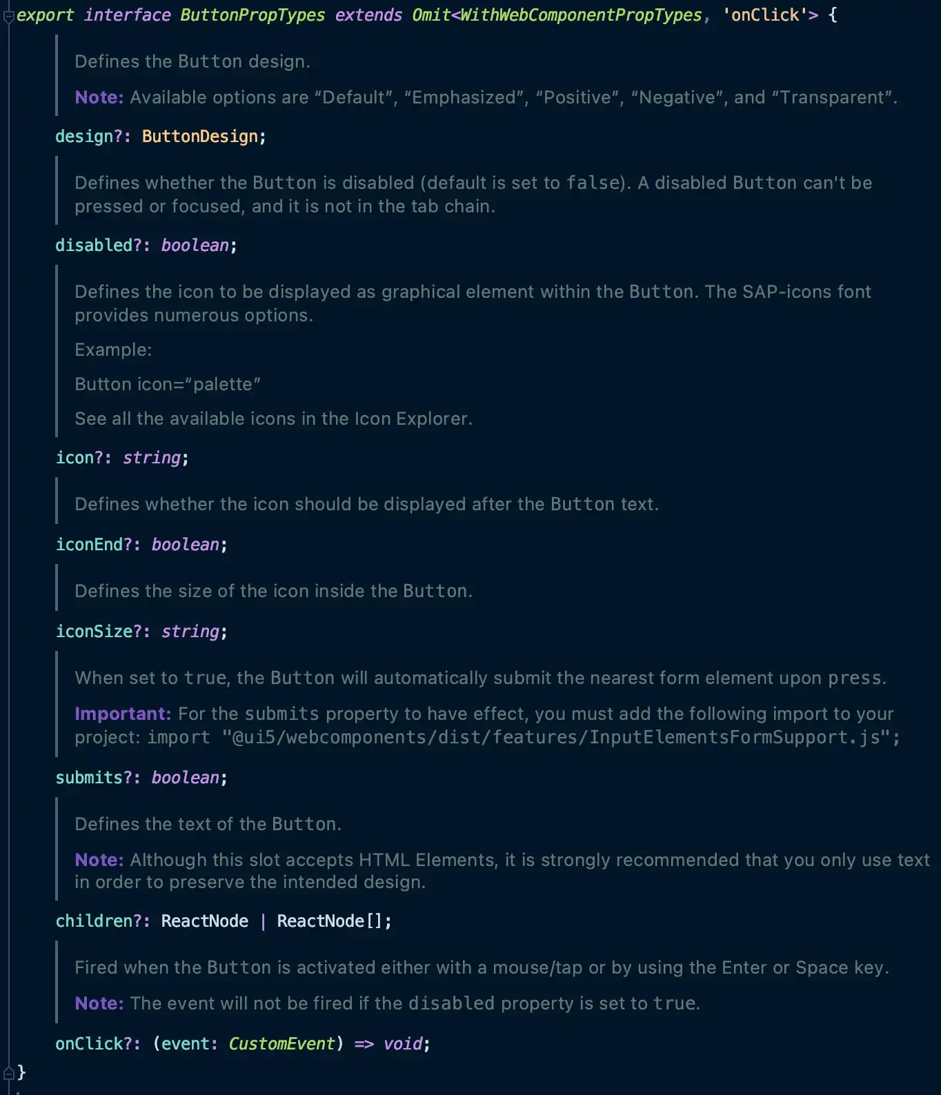
Wrapper Components
Our Wrapper components are hiding the complexity of dealing with Custom Elements in React and let you use the UI5 Web Components in React as if they were "regular" React Components.
Boolean Prop Handling
with plain UI5 Web Components
import "@ui5/webcomponents/dist/Button";

function MyComponent() {
  const booleanPropsBtn1 = {};
  const booleanPropsBtn2 = {};

  const button1ShouldBeDisabled = false;
  const button2ShouldBeDisabled = true;

  if (button1ShouldBeDisabled === true) {
    booleanPropsBtn1.disabled = true;
  }
  if (button2ShouldBeDisabled === true) {
    booleanPropsBtn2.disabled = true;
  }

  return (
    <>
      <ui5-button
        onClick={() => alert("I'll be there onClick!")}
        {...booleanPropsBtn1}
      >
        Click me!
      </ui5-button>

      <ui5-button
        onClick={() => alert("I will never show up!")}
        {...booleanPropsBtn2}
      >
        But you can't click me!
      </ui5-button>
    </>
  );
}
with UI5 Web Components for React
import { Button } from "@ui5/webcomponents-react";

function MyComponent() {

  return (
    <>
      <Button
          onClick={() => alert("I'll be there onClick!")}
          disabled={false}
      >
        Click me!
      </Button>
      <Button
          onClick={() => alert("I will never show up!")}
          disabled={true}
      >
        But you can't click me!
      </Button>
    </>
  );
}
Event Handlers
with plain UI5 Web Components
import "@ui5/webcomponents/dist/Calendar";

function MyComponent() {
  const ref = useRef();

  useEffect(() => {
    const currentRef = ref.current;
    const handler = (e) => {
      e.detail.dates.forEach((d) => {
        alert(new Date(d * 1000));
      });
    };

    // bind the event handler after the component has mounted
    if (currentRef) {
      currentRef.addEventListener("selected-dates-change", handler);
    }

    // remove the event handler before component unmounts to free up memory
    return () => {
      if (currentRef) {
        currentRef.removeEventListener("selected-dates-change", handler);
      }
    };
  }, []);

  return <ui5-calendar ref={ref} />;
}
with UI5 Web Components for React
import { Calendar } from "@ui5/webcomponents-react";

function MyComponent() {
  return (
    <Calendar
      onSelectedDatesChange={(e) => {
        e.detail.dates.forEach((d) => alert(new Date(d * 1000)));
      }}
    />
  );
}
Support for standard HTML props
with plain UI5 Web Components
import "@ui5/webcomponents/dist/Label";

function MyComponent() {
  return <ui5-label class="textColorRed">I'm a text!</ui5-label>;
}
with UI5 Web Components for React
import { Label } from "@ui5/webcomponents-react";

function MyComponent() {
  return <Label className="textColorRed">I'm a text!</Label>;
}
In addition to fixing the className issue, our components are also passing through all aria-, data- and event handler
attributes.
Complex Layouts and Charts
Complex Layouts and Charts
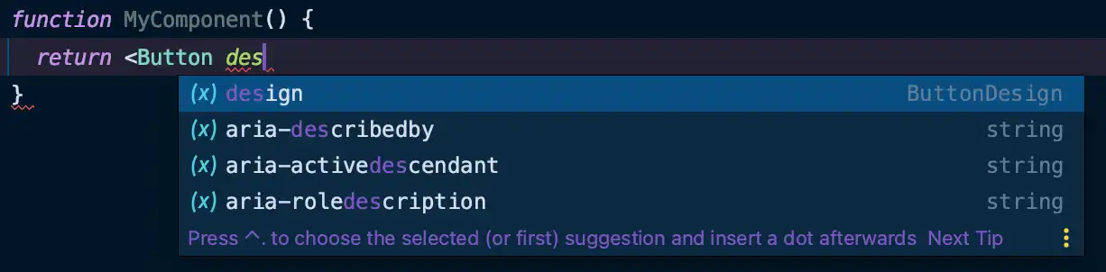
Type Definitions